mpriors

product

Every chart shows what price did. Ours answers why — and whether it matters.

Mpriors is a chart family built around three questions: What happened? Is it unusual? Why did it move? The first is table stakes done honestly. The other two, no charting product at any price can answer — because answering them takes a decomposition engine, and we're the ones who built it.

No candlesticks. No volume bars. No indicator zoo.

Green/red bars serve traders hunting levels and crossovers on a single name. Our users hunt relationships: spreads that stretch, pairs that decouple, members that leave their group. Skipping the candle arms race is not a gap — it's the strategy. Every quarter not spent re-implementing Bollinger bands is a quarter spent on things that can't be screenshotted from another product.

01 · the honest floor

What happened? — answered with integrity.

Everything here is hygiene a trader assumes before trusting a chart. None of it is differentiating — which is exactly why it must be unremarkable: done, honest, and never thought about again. A screenshot of any mpriors chart answers: what am I seeing, of what, since when, versus what.

⟨ load 1Y more loaded · 366 days shown · 30 days (8%) 1M · Jul 7 → Aug 6 · 1Day · 22 bars ● open · 10:42 PT
the navigator: loaded-versus-shown becomes a picture instead of an inspector fact
The navigatorhistory at a glance

A context strip under every chart shows where the visible window sits inside everything loaded. Drag the body to pan, the handles to resize, the left edge to fetch deeper history — without ever losing your place.

Market timesessions on the axis

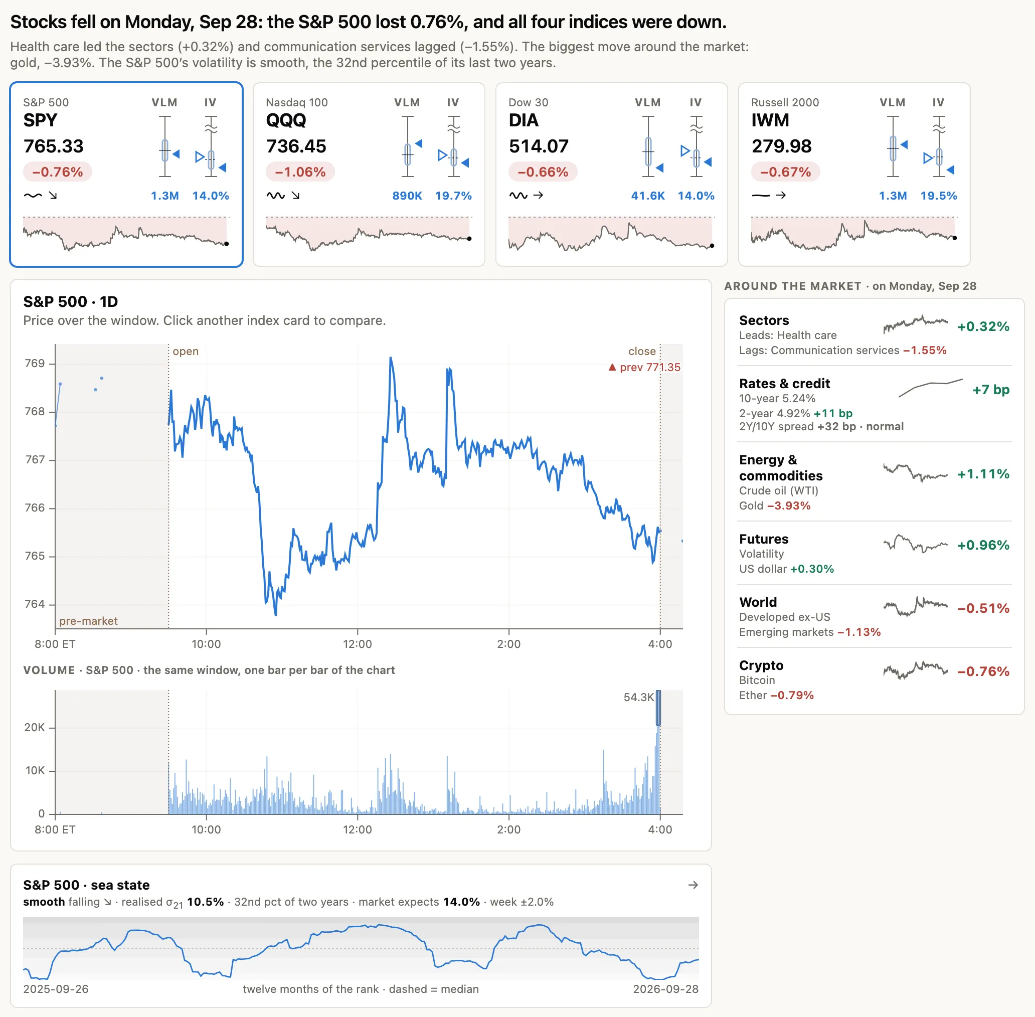
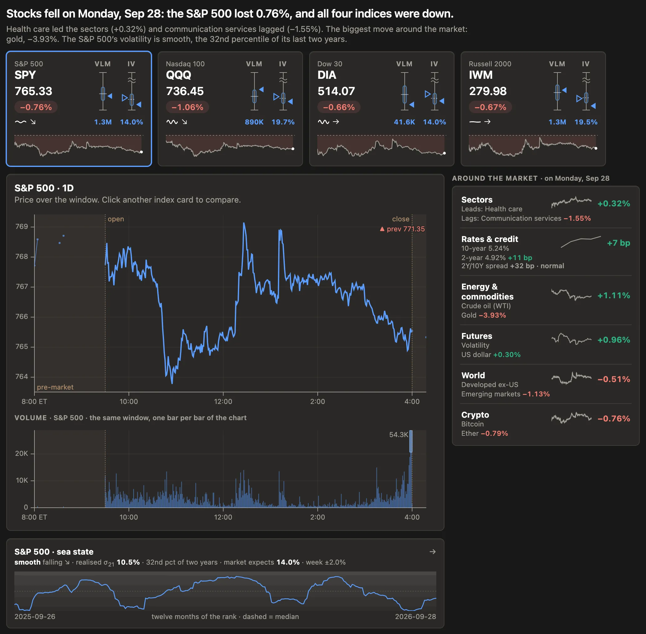
Pre-market and after-hours shaded, open and close ticked, the previous close as a dashed reference, a market-status chip with the exchange clock. The calendar knows holidays and half-days.

The comparison contractfour tested invariants

All series share a union time grid; every line crosses the baseline together at the first common bar; a series that starts later joins at a marked point, its absent history never faked; incomplete trailing bars are dropped. Enforced in unit tests, not conventions.

A data-density budget60–300 points, always

Resolution follows the window, not the preset: the finest timeframe that keeps the chart within a points-per-pixel budget, with pan headroom prefetched. No more 56 points stretched across 900 pixels.

A visible anchornothing relative without a referent

The rebase anchor has a physical marker. If the baseline pans out of frame, an edge cue says where it went — "+4%" always has something to be +4% of.

Colors that workCVD-verified in CI

Adjacent series are separable for colorblind users — validated by a simulator in continuous integration, not by eye, with direct labels on every series.

02 · relationships

The relationship is the chart.

Other tools make you infer the spread by squinting at two rebased lines. Mpriors gives the relationship its own geometry, statistics, and gestures.

The pair workbenchthe centerpiece

Two synced panels: the legs above, and below them the β-hedged spread as a z-score — the mean-reversion instrument itself — with ±1σ/±2σ bands and divergence shading. One x-axis, one crosshair, one viewport.

Morphing viewslegs ⇄ spread ⇄ ratio

Three representations of the same data are one chart in three states. Toggle to "spread" and two lines visibly collapse into one — you never lose the thread of what you're looking at.

The relationship stripβ and correlation over time

Relationships aren't constants. A rolling strip under every comparison answers, at a glance, whether the spread you're watching still exists — a β break is the story.

Leave-one-outa member vs its group, honestly

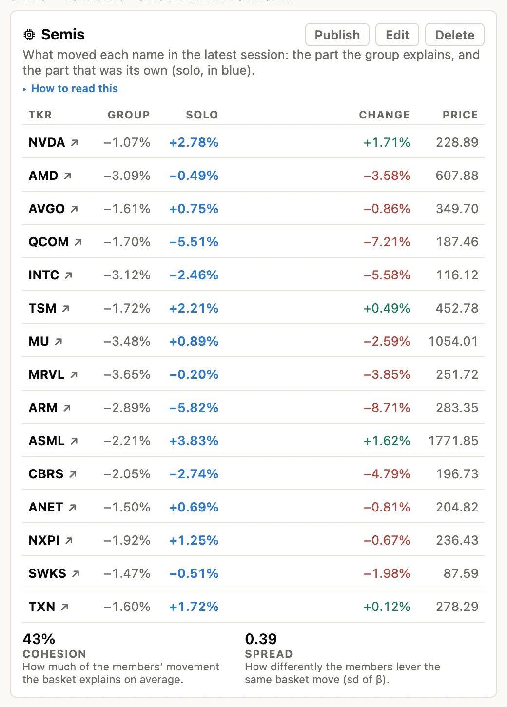
Chart NVDA against Semis-ex-NVDA — the composite recomputed without the member, so the name is never compared against itself. The default drill-down from every basket row.

03 · explain

Charts that argue.

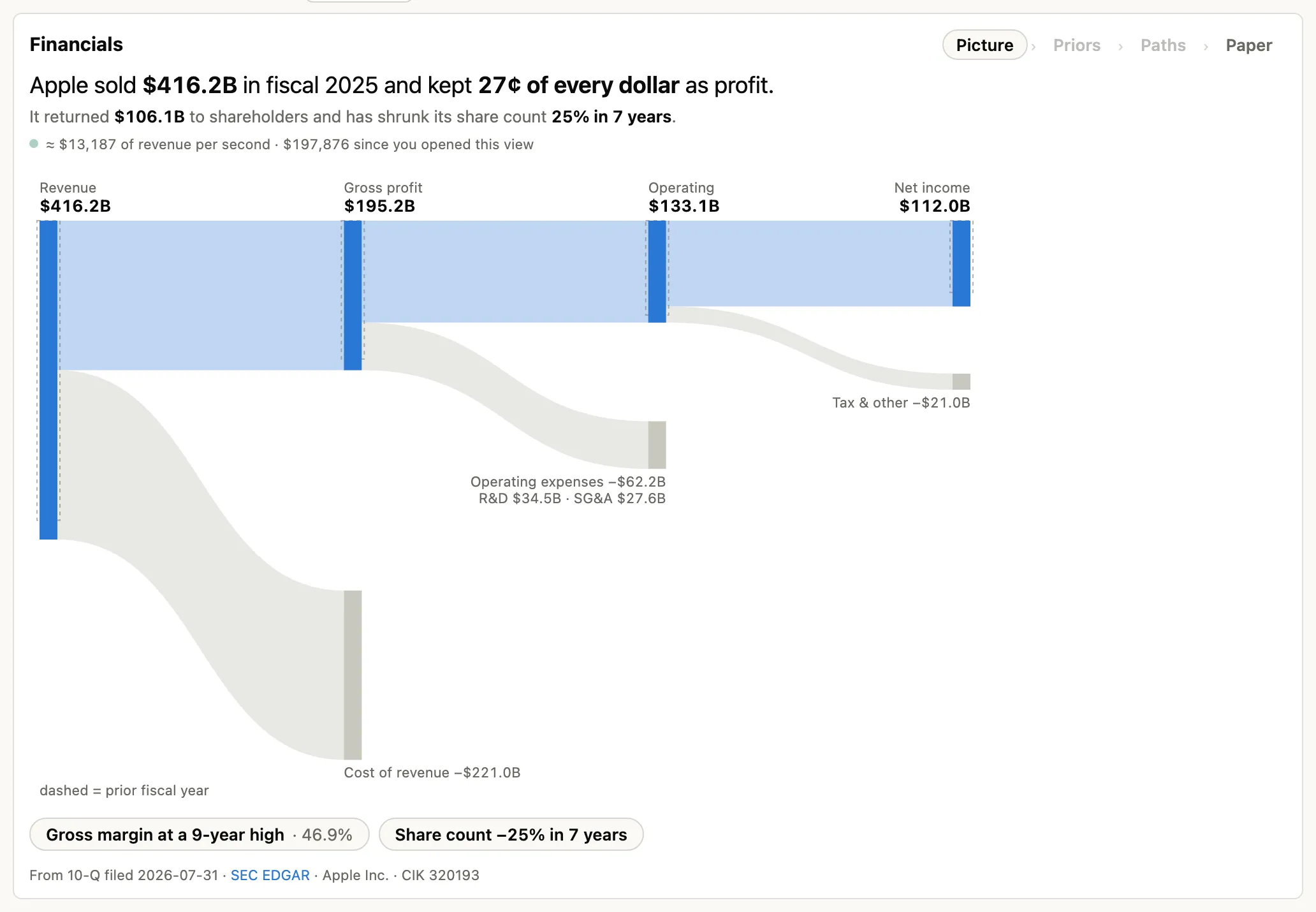
For every member and every session, mpriors computes the identity change = group + solo — the β-weighted group contribution plus the name's own move. Drawn on the chart, price action becomes an argument, and clicking any day yields the sentence.

One toggle further, the solo line plots the name with its group subtracted. Flat means "just a semi"; trending means a genuine idiosyncratic story. And instead of press-release flags, explained events mark the days the name actually broke from its group — each marker already carrying its explanation.

04 · priors

Charts that know what's normal.

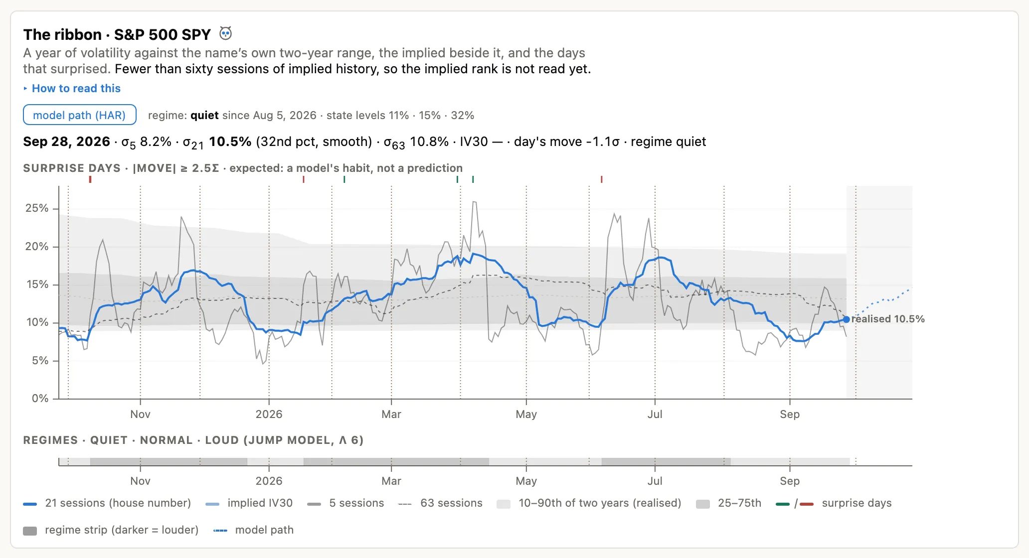
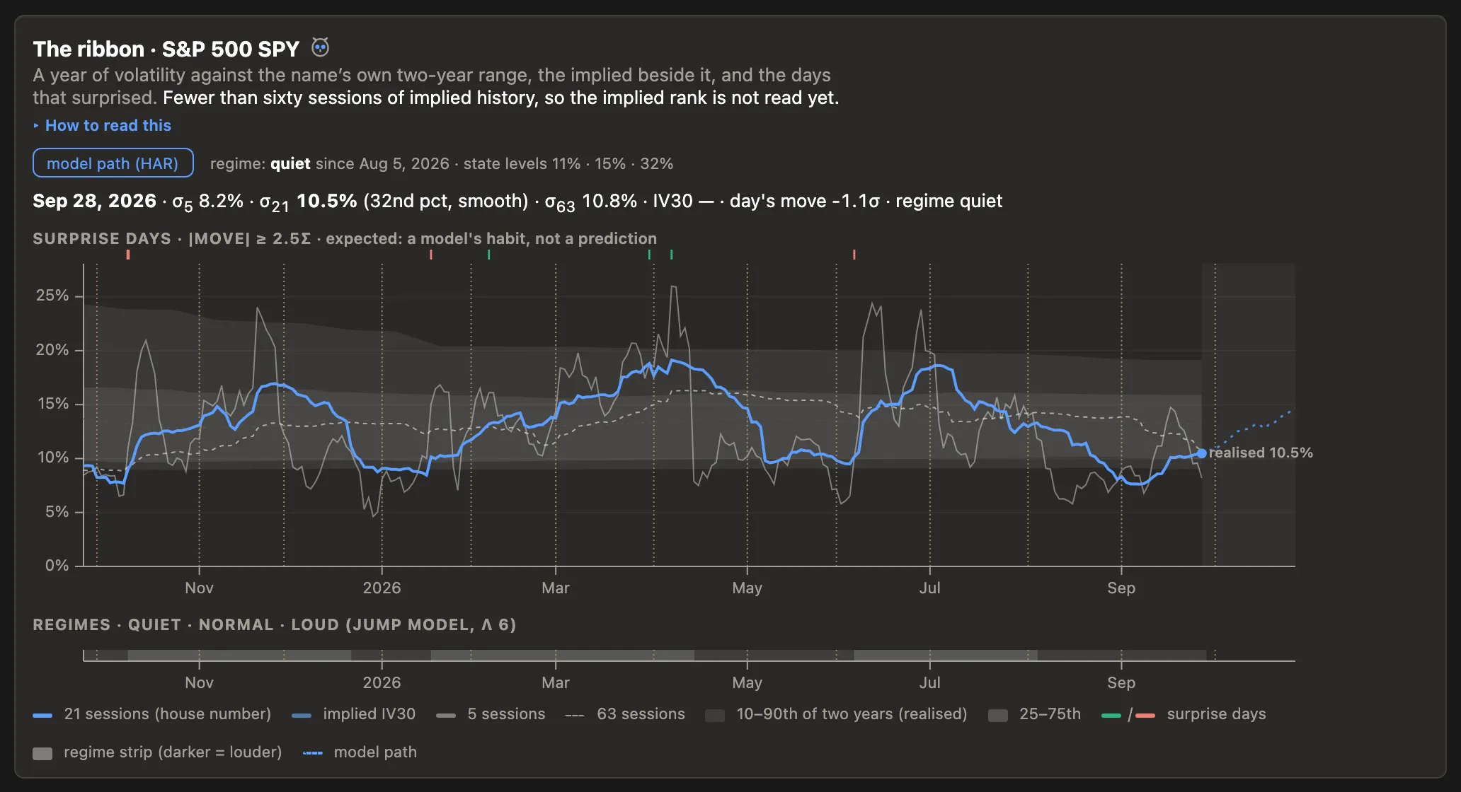
The product is named after the idea: context carried on the chart, so an unusual day is visually loud and a normal day is visually quiet — for any name, without you knowing its volatility by heart.

the ghost prior

Today against its typical session

A band of recent sessions, scaled to current volatility, drawn behind today's tape. When the line leaves its band, that's the story — labeled in σ, with methodology and sample size one tap away. Context, never prediction.

σ-UNITS

The honest comparison axis

A y-axis measured in each name's own daily σ instead of percent. Cross-name comparisons become comparisons of surprise, not amplitude — arguably the correct default for a relationships product.

analog search

"When did it look like this?"

Sweep any window and the system finds its nearest historical neighbors — shape- and vol-normalized — ghosts the top matches behind the live line, and shows the distribution of what followed. Backtesting intuition as a gesture, not a notebook.

surprise coloring

Attention flows to the unusual

Optional coloring by rolling z of returns: the eye lands on the abnormal stretch of tape, not on whether today happens to be green or red.

05 · time

Time is a material, not an axis label.

Two-thirds of wall-clock time, nothing can trade. Mpriors treats time as compressible, alignable, and replayable.

T-0 · earnings T−30d T+30d NVDA · Q2 AMD · Q2
event time: the x-axis becomes "days since the event" — reactions comparable across names and quarters
Trading timeclosed hours removed

A five-day chart becomes five sessions shoulder-to-shoulder with subtle seams — every pixel is tradable time, instead of ⅔ dead air.

Event timealign on T-0

Earnings, a Fed day, the day a name joined a basket: align any set of series on the event and compare the reactions directly.

Replaywith explanations running

Scrub any historical window with the live layers on — priors bands populating, spreads diverging, the decomposition updating bar by bar. For post-mortems and honest "would I have seen it?" review. Only mpriors can replay with explanations, because the explanation layers run on the same pipeline.

06 · the statistics beneath

From measuring to understanding.

Under the charts sits the full stack the pairs-trading literature says a divergence deserves — computed per relationship, described plainly, never prescriptive.

The tradability panelfour facts, methods named

Reversion tendency ("historically pulled back toward the group" vs "drifts — no pull detected"), half-life ("stretches like today's typically halved in ~9 sessions"), relationship kind (return co-movement vs price-level equilibrium), and sample honesty. Never a grade, never a recommendation.

The divergence feedthe morning screen

Every watched relationship, sorted by how stretched it is versus how it has historically behaved. "What stretched today?" answered in under five seconds.

Assumption watchthe tripwire

Mean reversion breaks rarely and violently — usually at maximum confidence. Mpriors monitors the assumptions: β stability, cohesion decay, half-life drift, record stretch. When the ground moves, you get a notice that names the assumption, not an action.

The book viewNeff, the ceiling no one mentions

Watching six correlated spreads is not six bets. The book view computes your effective independent bets from the correlation of your divergences — six spreads at ρ̄ 0.5 are about 1.7 — and shows which one is redundant.

Discovery, labeledfalse-discovery math included

Scan for candidate relationships and every result carries its trials count: "1,240 pairs examined; ~62 would look this good by chance; this one held for 3 distinct regimes." The only scanner a statistician wouldn't wince at.

07 · the frame

Where we play — and where we refuse to.

Capability TradingView ChartIQ Google Fin. Robinhood mpriors
Navigator / context strip yesyes yes — floor
Session-aware time axis yesyespartialpartial yes — floor
Candles + indicator zoo deepdeep refused, on purpose
Pair spread with σ-bands, β-hedged DIY scripts core object
Group-vs-solo decomposition on chart only us
Prior-aware rendering (σ-units, ghosts, analogs) only us
Event-relative time alignment yes
Out-of-sample idea ledger only us

The middle rows are where incumbents are deep and we deliberately don't play. The bottom rows are where nobody plays — and we already own the machinery.

The chart no incumbent can copy.

Copying the screen without the statistics produces visibly wrong numbers — and our audience checks.