mpriors

mpriors · relationship-first market analytics

Trade the relationship,
not the ticker.

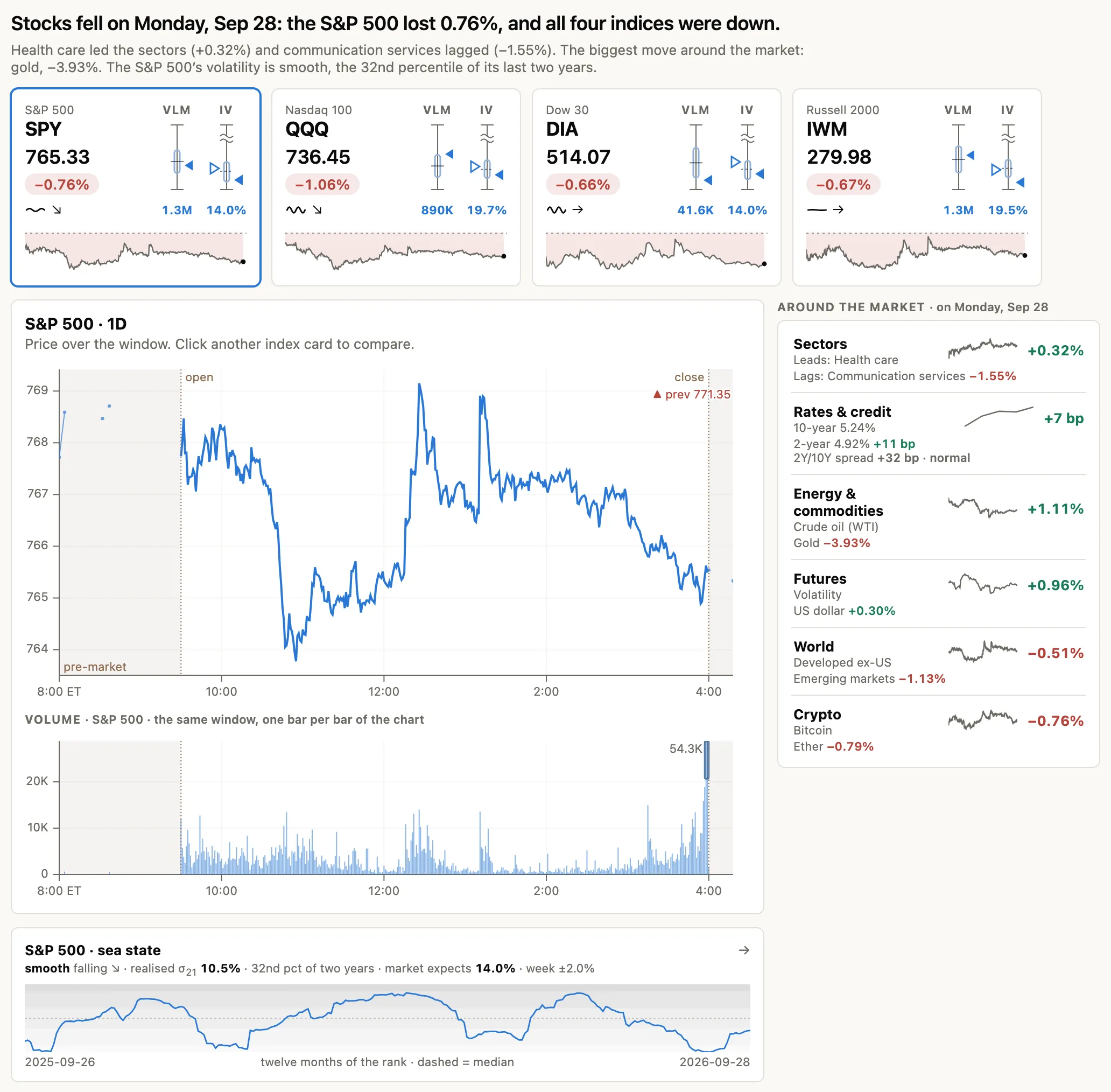
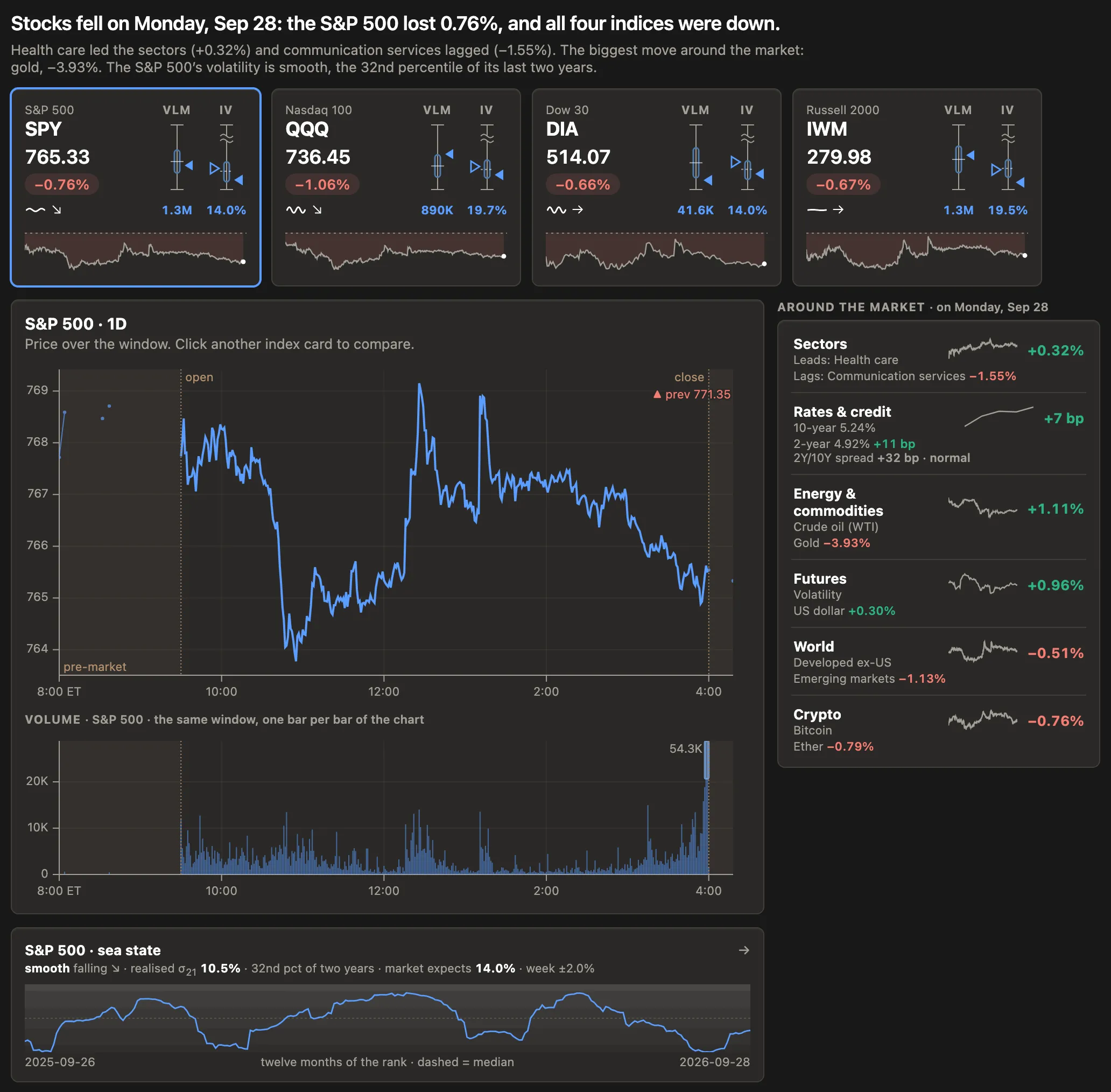
Every trading app is the same screen: one symbol, a candlestick chart, two hundred indicators. Mpriors is built around the thing professionals actually watch — how stocks move against each other — and it shows its math.

NVDA group-explained (β · semis) solo — its own story
Aug 6 · NVDA +5.1% = group +1.9% (β 1.3 × semis +1.5%) + solo +3.2% ← its own story
the shaded gap is everything the group cannot explain — drawn from the same engine that fills the tables, so the chart and the numbers never disagree

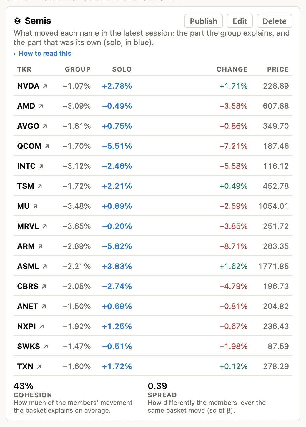
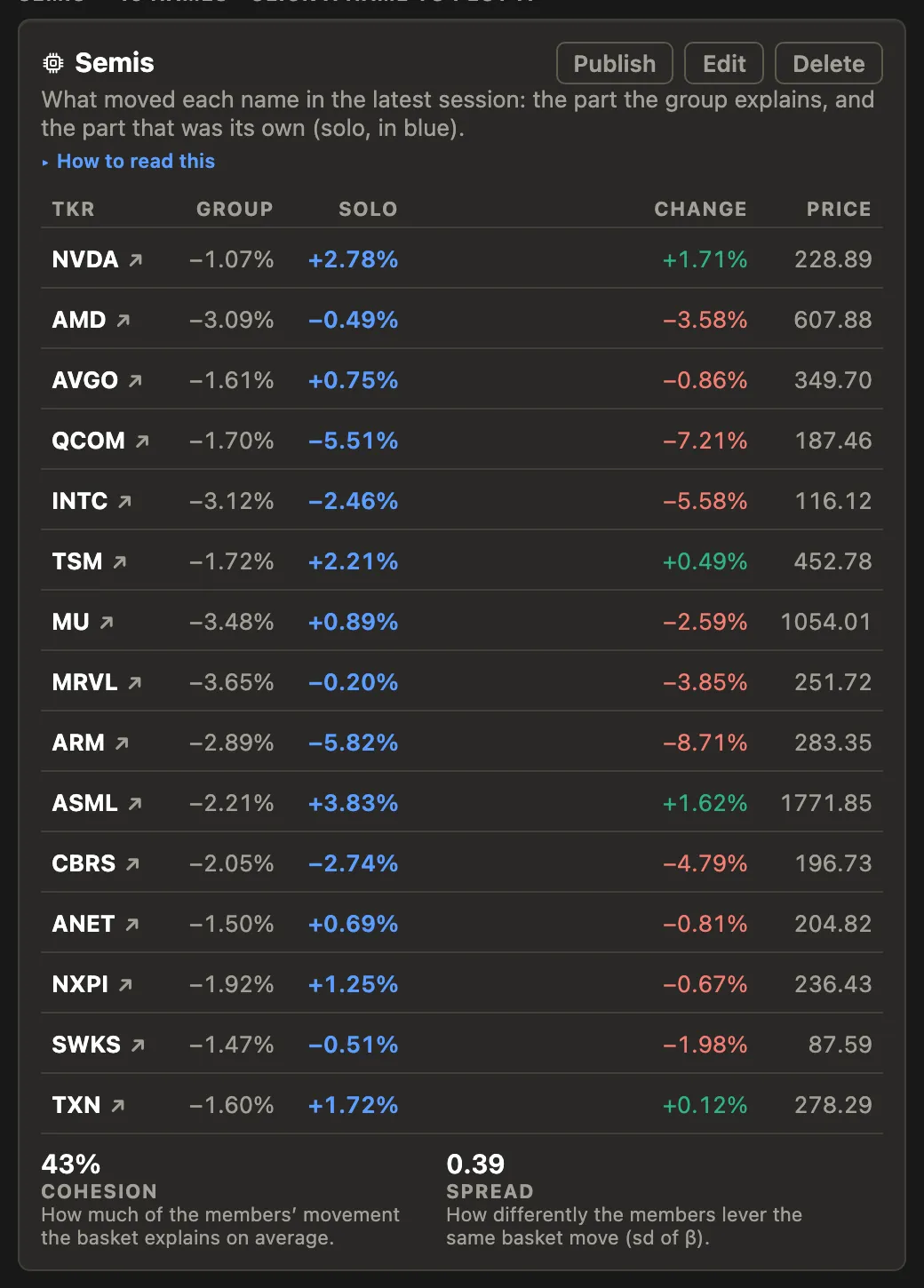
change = group + solo

The product's one equation. Every number on every screen reconciles to it — exactly, to a basis point — or the app refuses to render. That's a promise, and it's tested →

01 · why mpriors exists

Retail tooling answers the shallow question.

Single-name charting is a commoditized arms race — candles, RSI, moving averages — and all of it answers the same thing: what did the price do? Meanwhile, the questions that professional desks organize around go unserved below $2,000 a month: Is this move the stock, or its group? Is this divergence unusual? How fast has it historically snapped back?

them

200 indicators

On one symbol. None explained, all lagging, each one a setting to fiddle instead of a question answered.

them

Green / red candles

Direction without context. Was +2% a lot — for this name, on this day, against its own history? The chart can't say.

mpriors

One equation, shown

Every move split into what the group explains and what the stock did alone — on the chart, in the table, in the same sentence.

02 · the product

Three questions, one chart family.

Charting products compete on how much they can draw. Mpriors competes on what a chart can answer — and refuses the candle arms race entirely to get there.

table stakes

What happened?

Honest windows, honest sessions, honest comparisons. Every multi-series chart rebases on a common anchor, partial bars are dropped, and the visible window is always shown inside its history. The floor every trader assumes — done with more integrity than the incumbents.

the name is the roadmap

Is it unusual?

Every move rendered against the name's own prior — expected ranges, ghost sessions, σ-units instead of percent. A 2% move in a sleepy staple and a 2% move in a hot semi are different events, and the chart finally says so.

nobody else can

Why did it move?

The decomposition engine draws change = group + solo on the chart itself. Not "NVDA rose 2.4%" but "NVDA rose 2.4%, and 1.6 of that was just semis being semis." Charts that argue, not just display.

03 · context

A 2% day means nothing until you know what's normal.

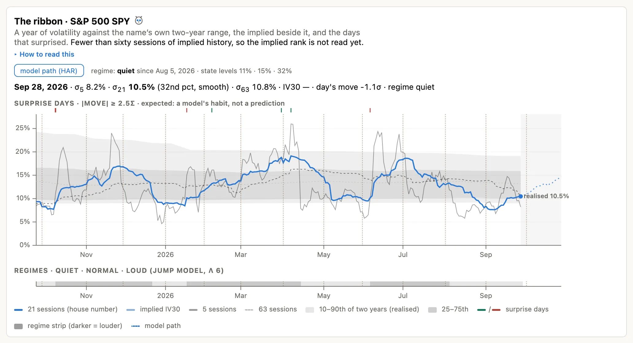
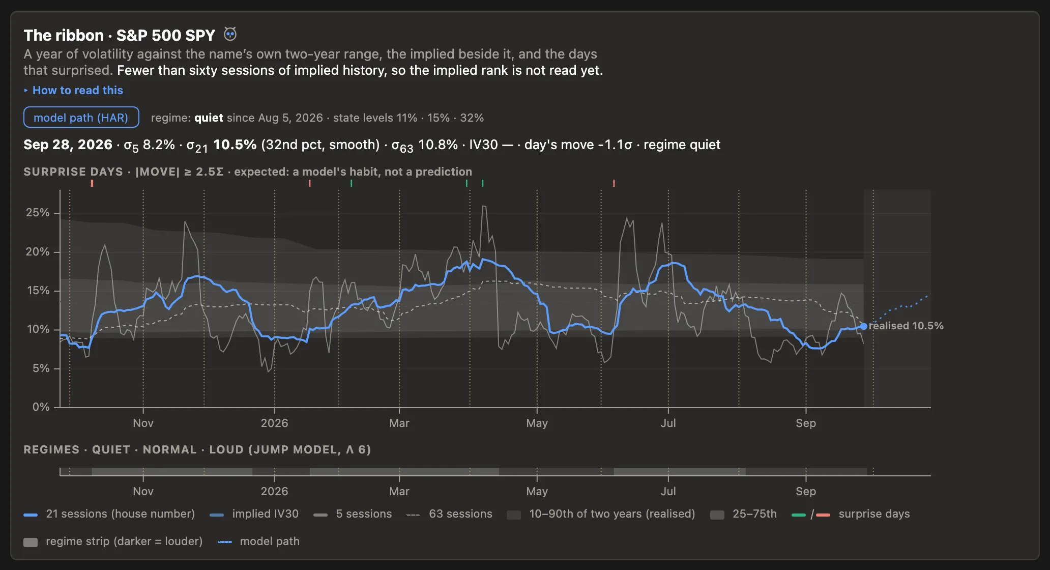
A price path on a bare grid asks you to supply the context from memory. A mpriors chart carries its own: the ghost of a typical session, scaled to current volatility, drawn behind today's tape.

When today leaves its band, that reads instantly — and it reads in σ, not percent, so surprise is comparable across names. The band is an empirical prior, never a forecast, and its methodology is always one tap away.

−2.1σ vs typical by 10:40 06:30 open 13:00 close middle 80% of the last 60 sessions
an empirical prior, not a prediction — methodology and sample size always labeled
NVDA AMD β 1.15 · 120d · corr 0.84
+2σ 0 −2σ z +2.3σ · 9d
spread = NVDA − 1.15 × AMD · z over rolling 60d · bands at ±1σ, ±2σ · divergence shaded

04 · relationships

The spread, properly.

For a pairs trader the tradable object is not either leg — it is the relationship between them. Mpriors makes it a first-class chart: the β-hedged spread as a z-score, with ±1σ/±2σ bands, divergence shading, and the history of the relationship itself — rolling β and correlation — right underneath.

And because β comes from the same engine as the decomposition, the chart and the tables never disagree about how much of one leg is "explained" by the other. Until now this took DIY scripts or a $2,000-a-month terminal.

stretches like this one typically halved in ~9 sessions — and the panel says so, with its test and sample size named

05 · your record

Kept honest — including you.

The moment you save a watched divergence, that timestamp becomes its out-of-sample start. From then on the outcome accrues automatically: reverted, still moving, or broken.

The result is a personal record no screenshot can inflate — the discipline professional desks impose on their forecasters, applied to your own ideas. Nobody in retail offers this. It's the feature we're proudest of, and it doesn't draw a single chart.

06 · the vocabulary

What you will never hear from us.

Mpriors ships with a compliance vocabulary enforced in code: if a word can't appear in the app, it can't appear on this page either. One voice, and the constraint is the differentiation.

never"Beat the market." instead"See what the market can't explain."
neverTrade recommendations. instead"This divergence is 2.3σ — the widest in 60 sessions."
never"AI-powered picks." instead"Here is the regression. Here is its bias. We measured it."
neverBacktest curves in ads. insteadThe out-of-sample ledger — records that start when you save, not when we cherry-pick.
neverUrgency. "Act now." insteadPatience as identity: mean reversion is the slow trade; so is trust.

07 · who it's for

Four audiences, one hunger: rigor without a Bloomberg.

the quant-curious trader

"I know candles are astrology. Show me real structure."

Reads the quant blogs, runs a spreadsheet of pairs, priced out of institutional tools. Mpriors is the first purpose-built home.

the pairs & spread hobbyist

"I trade GLD/GDX and semis vs SMH. Everything I use fights me."

Already thinks in relationships. Nothing serves them below $2k/mo — until now.

the basket thinker

"I don't follow single stories. I follow themes and their outliers."

Builds watchlists that are really theses. Mpriors turns each one into an engine that says which member left the pack — and whether that's rare.

students & educators

"I teach this. I finally have something honest to point at."

Decomposition, cointegration, and half-life on live data, free — the textbook companion for finance courses and quant clubs.

08 · pricing

Free teaches the concept. Pro is the workflow.

observer · $0

The whole concept, uncrippled

Two baskets, delayed data, the full decomposition and chart family. If the free tier can't teach the category, nothing upstream of it matters.

practitioner · $29/mo

The daily workflow

Unlimited baskets and pairs, live data, the divergence feed, tradability panels, and the out-of-sample ledger. Priced against data subscriptions, not against apps.

See what your watchlist can't explain.

Build a basket of five names and the decomposition unlocks. That first split — group here, solo there, reconciling exactly — is the moment the category clicks.